
As an ardent follower of this blog, you will have noticed our excitement over using mobility data in spatial modelling projects. Our expertise in this area includes pitch, catchment and temporal analysis like our Day-In-The-Life-Of maps and Retail Recovery Index, which has been helping retailers and local authorities throughout the pandemic.
Luckily, as a data scientist at GEOLYTIX you also get material amounts of time to spend on asking what-if questions, like 'What are other ways of looking at spatio-temporal device data that exhibit meaningful and quantifiable patterns?' or 'How to draw a representative aggregate-level picture from mobility data which is inherently incomplete on an individual device-level?'
One of the R&D projects that had started with this type of question and has evolved into valuable model input are Interaction Surfaces.
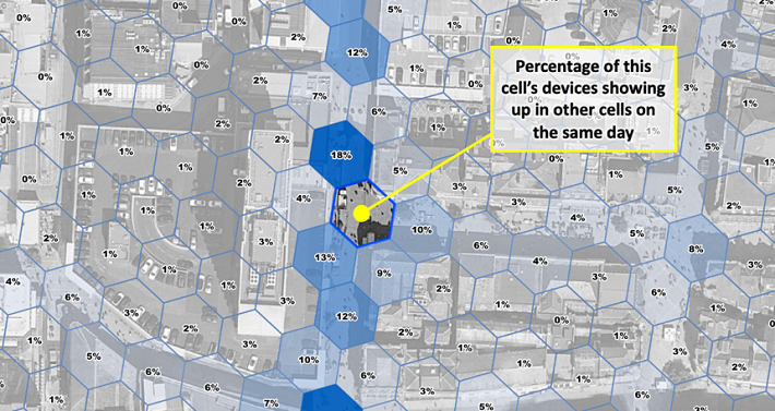
We regularly utilise mobility data to draw catchments of places using devices’ aggregated home locations. An interaction surface is similar in that it is drawn from other locations visited by the same devices visiting that place, except they use any other location. By doing so we can reveal hyper-local movement patterns not traditionally available in spatial interaction or spatially-enabled models. Among the many applications, we can now better quantify cannibalisation effects, relevance of footfall driving POI and outdoor advertising. The fact that measurable interaction around for instance, a store location, does not go far enough to include home or work locations for most visitors, also allows us to present it at sub-street-level granularity without showing Personal Identifiable Information.
But building interaction surfaces comes with an analytical challenge because quantifying location co-occurrence is more susceptible to the biases in notoriously patchy mobility data than quantifying activity in a single location. When people think about mobility data, they often envision a line representing a person going through space and time - a bit like those bubbly columns coming out of Donnie Darko’s chest in the film of the same name (go watch it, it has both Gyllenhaals in it).
When we look at mobility data it’s more like a game of Whac-A-Mole. Where a device pops up next can seem random - because the time interval is. And you would be a fool to draw straight lines between the two locations: we just do not know where a device is when it is not pinging - and thankfully so, otherwise no-one with any regard for privacy concerns could work with the data. Due to the way mobility data is collected, you will see devices with several pings per minute, hour, day or sometimes only a few per week. The ping rate may also change over time and space, depending on how devices are used.
Using patchy data to generate meaningful aggregate-level insights, however, is not uncommon. Imagine an online marketplace with some customers shopping very frequently, others only once or twice a year, some products being in demand all year round, others only during summer and for a very limited target audience. Yet, you won’t get a recommendation like “customers who bought instant coffee also bought AA batteries” just because there are lots of people who buy AA batteries. Whether it’s product recommendations, text auto-completion, or context-aware search, almost anything you do on the internet is supported by some kind of bag-of-words model, a comparison measure, and billions of data points. For interaction surfaces we adopted that very paradigm, except our bags contain locations, and we compare those locations using a probabilistic similarity measure.
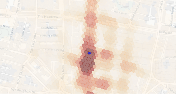
The basic concept underlying this type of similarity measure is to compare the observed number of co-occurrences to the expected number if individual occurrences were randomly distributed. In order to do that we first have to discretise the spatio-temporal dimension of the data, or in other words, slice the mobility data into chunks inside which we can count. Our chunks are hexagonal cells in the spatial dimension and days in the temporal one. Consequently, we observe one co-occurrence if two cells were visited by the same device on the same day. The expected number of co-occurrences can be calculated knowing the total number of devices on any given day and the total number devices in each of the cells using a basic urn model. The final similarity or interaction score measures how significant, i.e. “not random” the co-occurrence of two locations is. We do apply all sorts of noise reduction, smoothing, geometry cleaning and normalization techniques as well as privacy thresholds afterwards. But that notion of significance is what fundamentally makes our measure of interaction work.
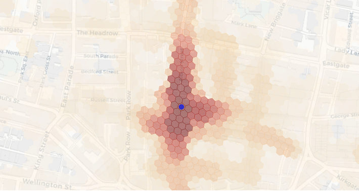
We also create a variation of interaction surfaces we call impact surfaces, which consider the total number of devices of each cell in the surface. This method lends itself especially well to cannibalisation analysis as it can be translated into shares of devices that have visited these cells. For example, you might get high interaction between London Victoria train and coach station entrances, which are about 500m apart. But if you were to open a pop-up coffee stall in both locations, the cannibalisation impact on the train station site would be much smaller than the one on the coach station site due to the difference in absolute visitor numbers.
If you would like to know more about interaction surfaces and how they can help you to optimize your estate or about the value mobility data adds to location planning projects in general, please reach out to christoph.mulligann@geolytix.co.uk or tim.pickworth@geolytix.co.uk.
Christoph Mülligann, Chief Innovator at Geolytix
Photo by Artur Kraft on Unsplash